
Launched 2025
The Clearbox Group
Fresh brand identities and website redesigns for three divisions within The Clearbox Group 📣
Visit Soda's websiteVisit Neigbourgood's website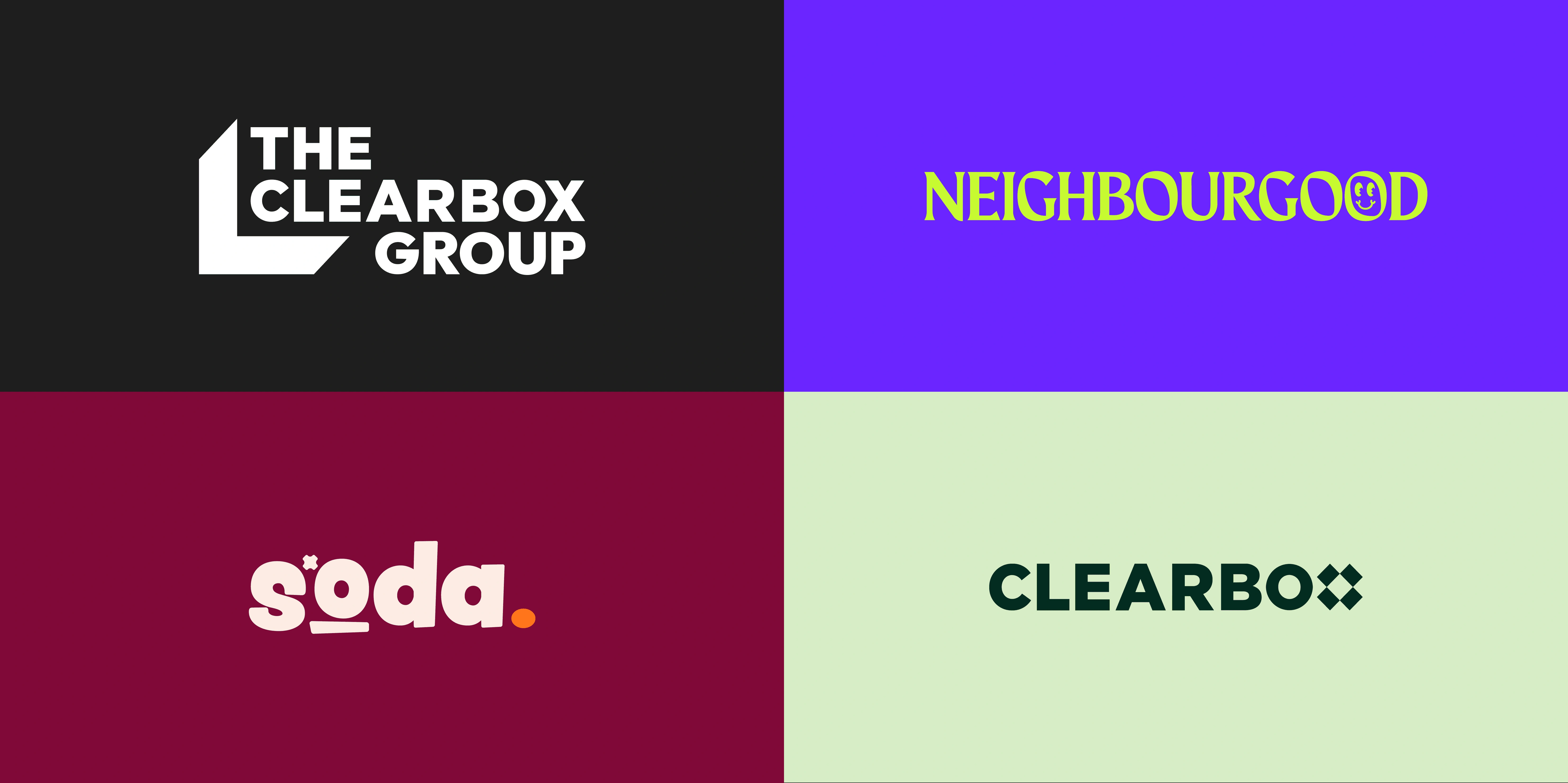
Fresh brand identities and website redesigns for three divisions within The Clearbox Group 📣
Visit Soda's websiteVisit Neigbourgood's websiteClearbox, an award-winning PR consultancy, has recently undergone a significant transformation, expanding into distinct business divisions. This evolution introduced Neighbourgood, a forward-thinking CSR consultancy and Soda, a cutting-edge social media agency. To unify these brands under a cohesive identity, The Clearbox Group was also established.
Collaborating with each team, I helped shape this transformation by creating new brand identities and developing high-impact websites that bring each division’s vision to life.
The Clearbox Group required a unified visual identity that could encompass its four brands - Clearbox, Neighbourgood, Soda and Allies, while allowing flexibility for future expansion.
To achieve this, I designed a logo that maintains a connection to Clearbox’s original identity while establishing The Clearbox Group as a distinct parent brand. The wordmark mirrors the original Clearbox logo, but the decorative ‘x’ was removed to ensure it stands independently and prevent confusion with its sub-brands. Instead, a box shape was incorporated to frame the wordmark - a visual nod to Clearbox’s origins and a symbolic representation of the group’s role in bringing multiple brands together.
The new logo provides brand clarity, honours history and provides long-term scalability as the organisation continues to grow.
Neighbourgood is a CSR consultancy that works with local and global brands to create meaningful, impactful community engagement programmes. As Neighbourgood had already established its branding, my role focused on refining and expanding its identity to allow for greater creativity and versatility in brand assets.
Key updates to the brand identity included:
Logo Refresh – The existing logo consisted of a wordmark and standalone icon. However, I was able to integrate the smiley face icon within the typographic wordmark as a decorative letterform, so that it matched the visual structure of Clearbox and Soda's logos.
Icon Enhancement – The smiley face icon was thickened to better complement the brand’s chosen font, ensuring consistency and readability across different applications.
Colour Palette Expansion – The colour scheme was altered to introduce warmer tones, maintaining brand recognition while ensuring optimal accessibility.
Brand Guidelines Creation - Documentation to ensure the team present the new Neighbourgood brand effectively, particularly the colour palette that consists of a variety of carefully considered combinations, each selected based on the required contrast to ensure usage is accessible to all users.

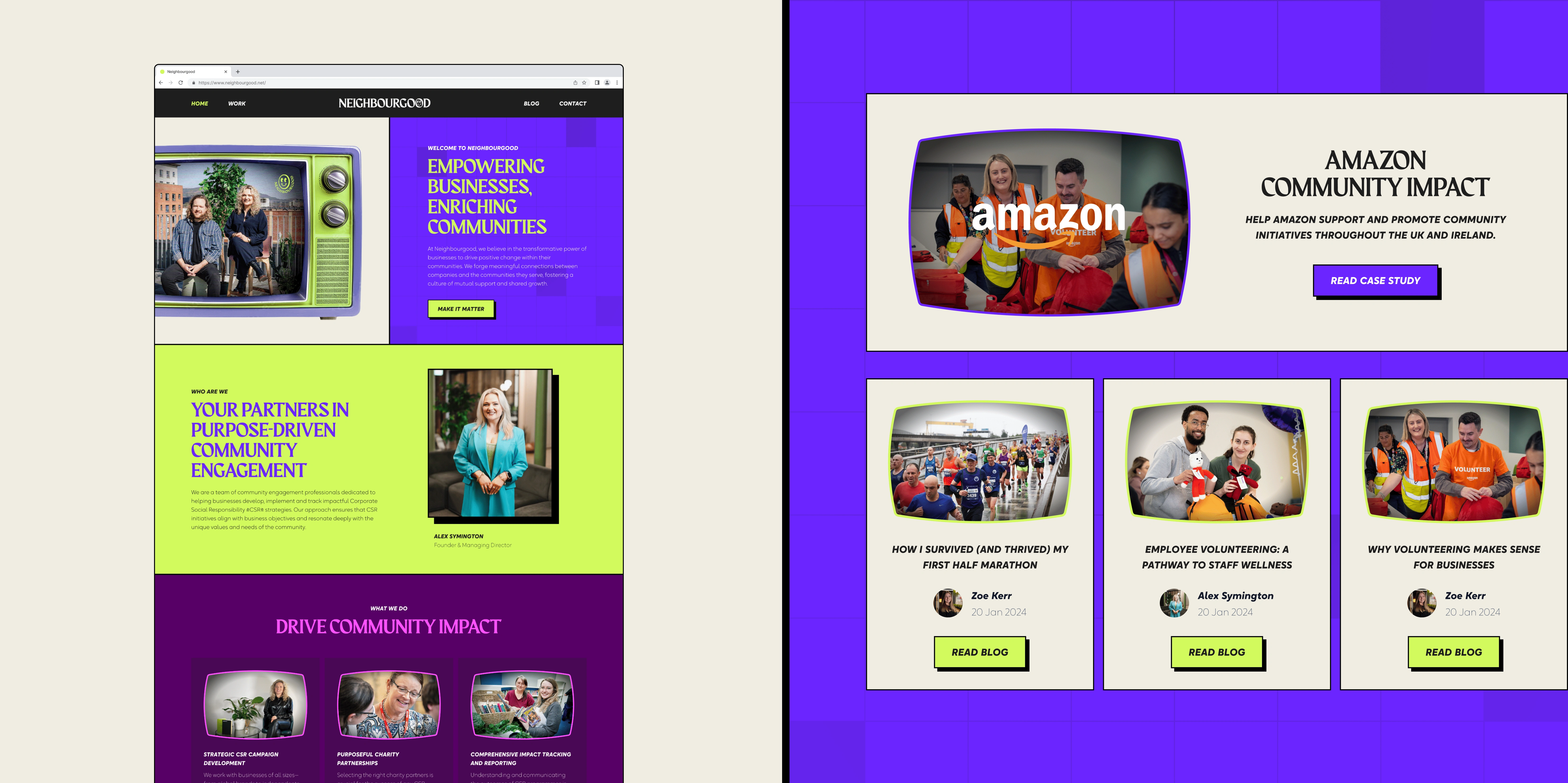
A bold website refresh for Neighbourgood, inspired by retro TV aesthetics. The design features TV-shaped frames, radial shadows, and grid-line overlays to create depth and motion, much like the glitchy or pixelated screens of early television. Strong borders, exaggerated drop shadows, and playful retro animations amplify the nostalgic feel, echoing the high-contrast drama of vintage broadcast graphics.
"A massive shout-out to Lucy and Matthew (partnering developer) for bringing our vision to life - they were both so incredibly wonderful to work with and just 'got”' it. Their talent is evident from the work they produce." - Alex at Neighbourgood.
As a brand-new division with no existing visual identity or digital presence, Soda presented an exciting opportunity for full-scale brand exploration from scratch.
Stakeholder interviews revealed a clear direction: the brand needed to feel fun, bubbly, young, and fresh, steering away from anything overly polished or aesthetic. Instead, Soda was to embody a sense of casual coolness - a brand that feels approachable and full of personality.

Soda’s branding was inspired by three key themes:
Irish heritage: A nod to soda bread, reflecting the brand’s roots.
Soda drink: Bright, refreshing visuals that evoke a sense of energy and playfulness.
Social media: A brand designed for fun, positive engagement and connection.
The final logo fuses these inspirations. The wordmark is framed by a wavy-edged circle, mimicking the ridged outline of a classic glass soda bottle cap. The "O" in Soda serves a dual purpose - it resembles a camera lens, connecting the brand’s identity to its social media focus, and the subtle "X" connects the Clearbox and Neighbourgood logos.
Beyond the logo, I illustrated a series of playful characters - an Irish soda bread loaf, with the iconic crisscross scoring on its top that also resembles a hashtag symbol, subtly tying into the theme of social media, as well as a digital camera and a soda can. The characters are brought to life with arms, legs, and dynamic poses, injecting personality into the brand.
To enhance storytelling, I created a suite of retro-themed stickers to be used across marketing materials, social media, and merchandise.

The Soda website was designed to reflect the brand’s energetic and approachable nature. Through bold primary colours, playful typography, and dynamic animations, the site delivers an engaging and immersive experience that resonates with its audience. It provides Soda with a strong online presence, showcasing their services and case studies, making it a powerful tool for connecting with customers and driving brand awareness.
"We quite literally wouldn’t have a brand without Lucy. You just need to visit our website to see how amazing she is at what she does! She is a wiz at translating my half-baked thoughts into magic" - Hannah at Soda.

The original brand, Clearbox is a PR agency built on big ideas. Following the success of Soda and Neighbourgood, Clearbox looked for a visual refresh that would bring the same sense of fun and energy to their foundational brand. The goal was to modernise their visual identity while preserving brand recognition, creating something more vibrant and aligned with the look and feel of its sister companies.
The refreshed identity focused on creating a bold personality while addressing accessibility challenges. The once-vibrant green and pink colour palette was softened into pastel tones, bringing a calmer, more approachable feel. The existing typography was developed into a structured type system, ensuring consistency across headings, subheadings, and body copy. A variety of visual elements now define the brand’s aesthetic:
Altogether, the new visual identity gives Clearbox a fun, fresh, and prominent presence.
Coming soon...

Northern Ireland’s modern furniture specialists, a luxury furniture store 🛋️
Read project
With a remarkable 170 years of experience, the experts in construction and civil engineering 🏗️
Read project
A multi-award winning, family owned Holiday Home business, nestled at the foot of the Mourne Mountains ⛰️
Read project
Replace 10+ travel apps with Hidden, connecting you with locals & past visitors to find the hidden gems of your next adventure 🗺️️
Read project
Product design in healthcare technology, shaping a clinical lab web app used by scientists worldwide 🩺
Read project