
Launched 2025
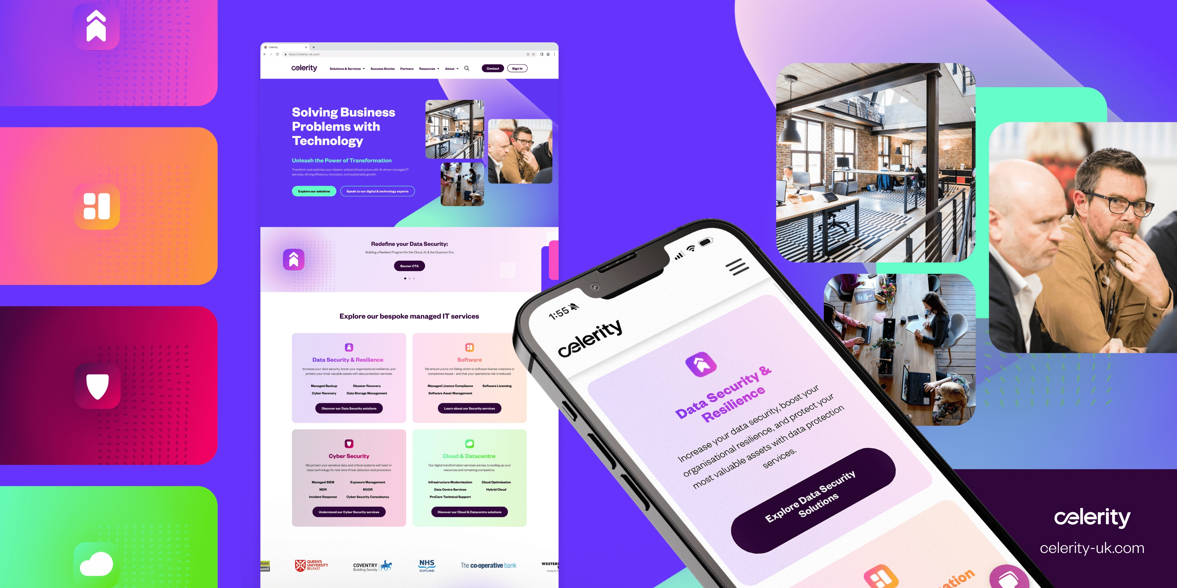
Celerity
Webapp and brochure website redesign for a UK IT solutions provider 🖱️
Visit assessment toolVisit Celerity's website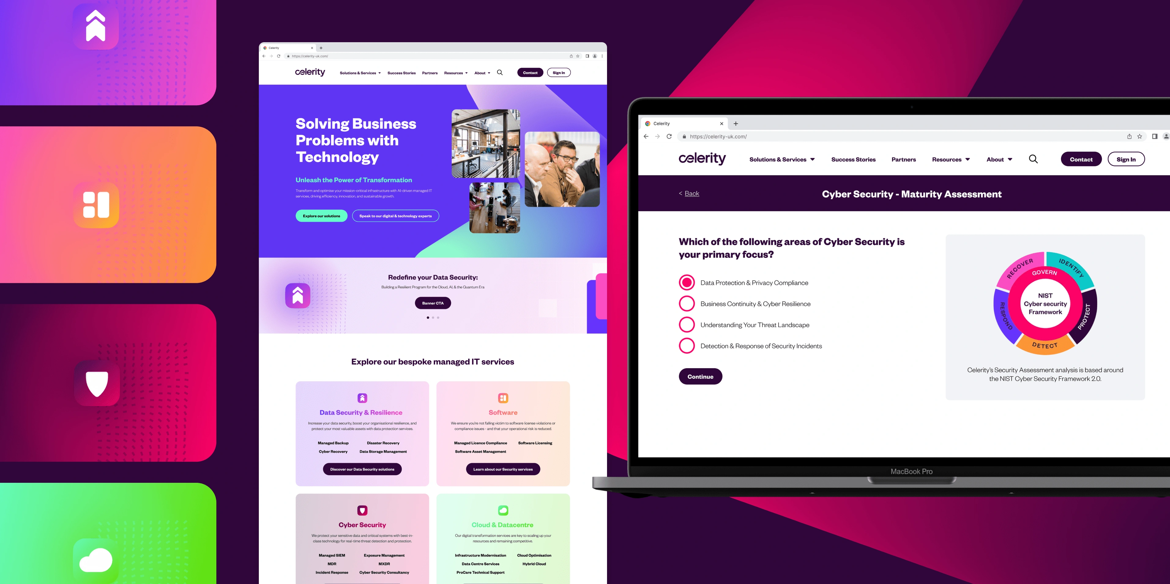
Webapp and brochure website redesign for a UK IT solutions provider 🖱️
Visit assessment toolVisit Celerity's websiteCelerity is an IT partner that specialises in cyber security, helping organisations protect their data.
Role: UX Researcher & Designer
Timeframe: 8 months
Deliverables: Redesign of Celerity’s Cyber Security Assessment Tool, which led to a complete overhaul of their brochure website.
Celerity initially engaged with Heyoo for marketing support but it became clear the challenge extended beyond SEO and messaging.
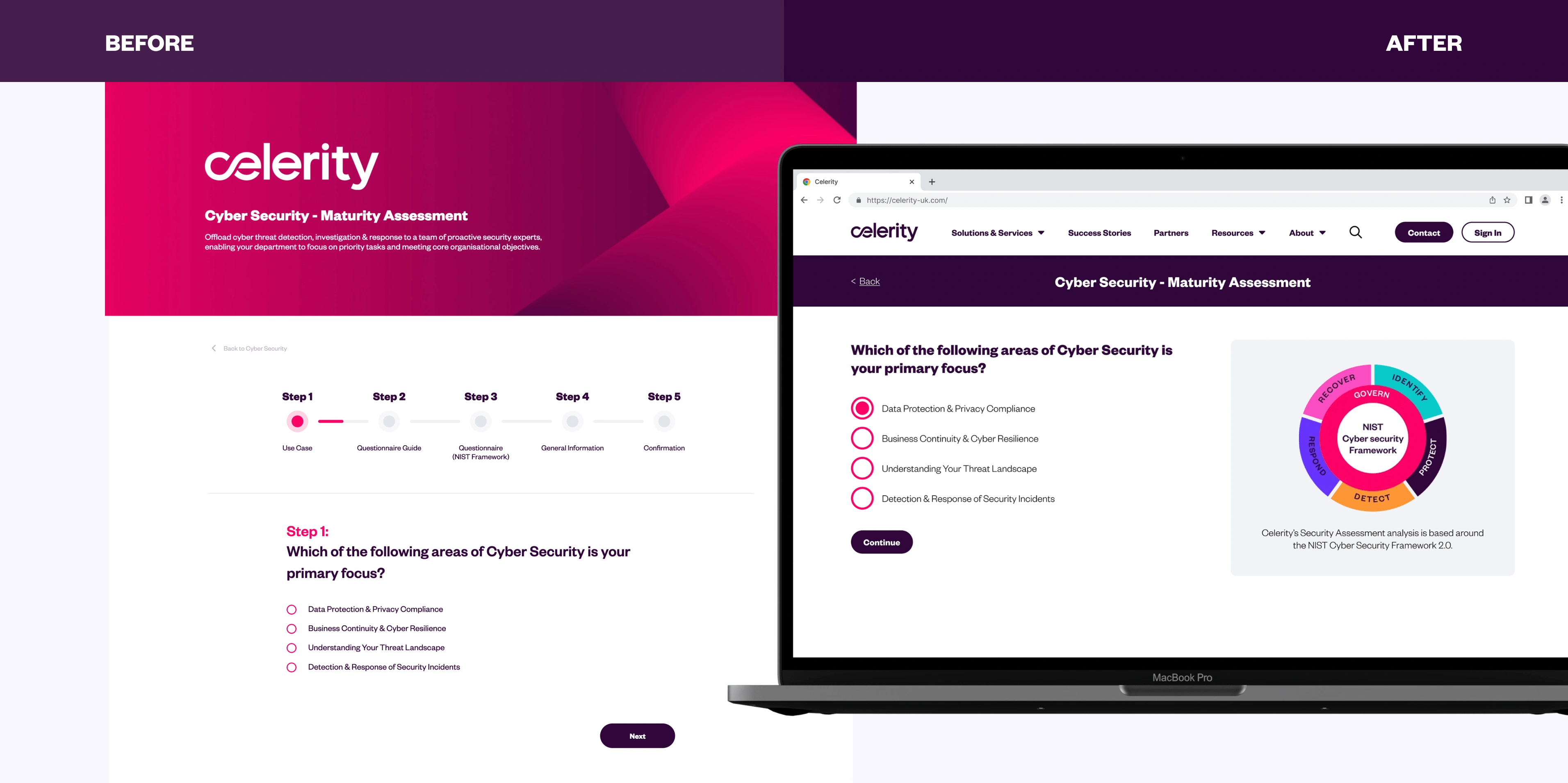
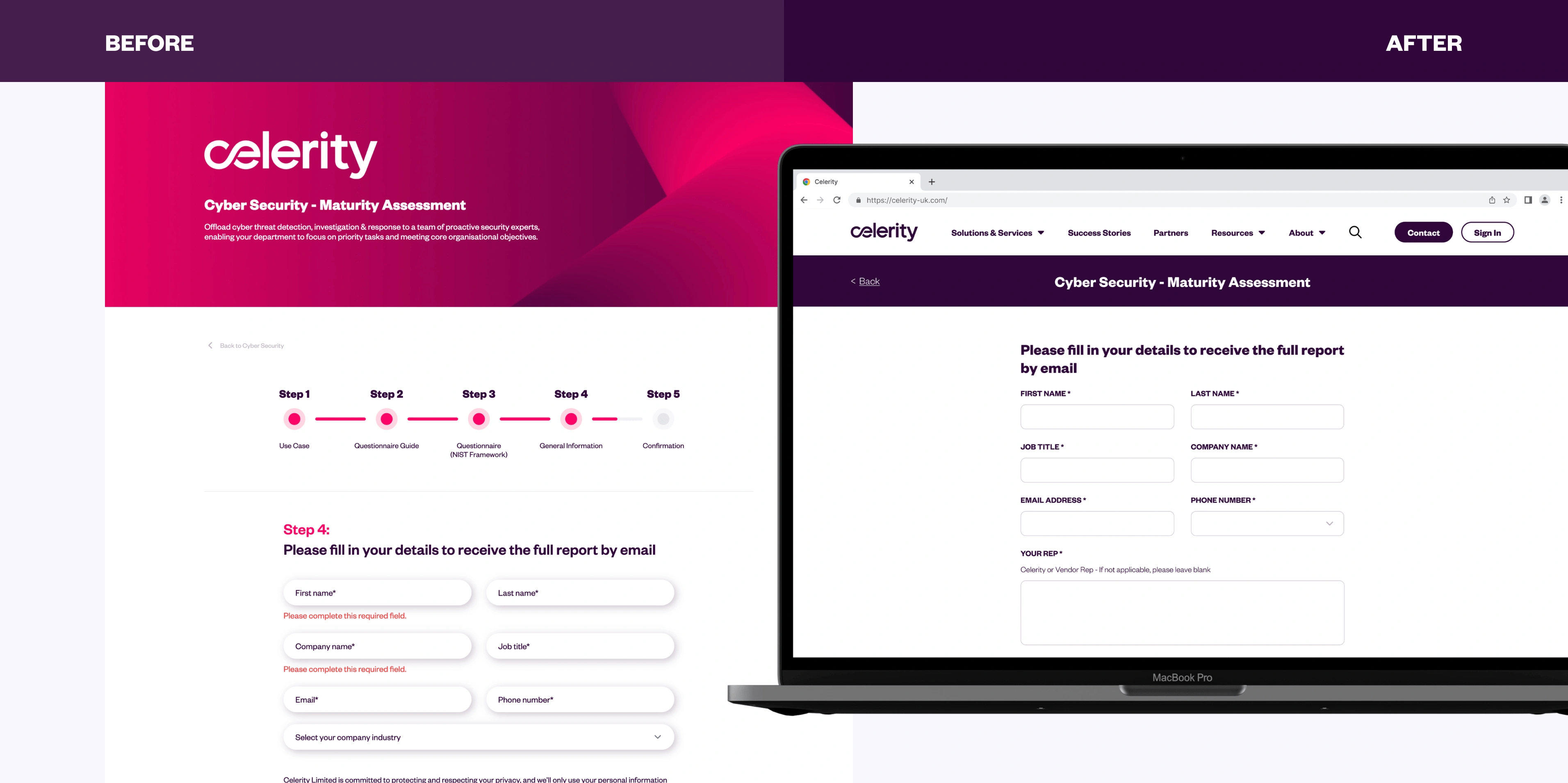
Their Cyber Security Assessment Tool, a key lead generation asset, was underperforming as despite consistent traffic from paid search campaigns, the completion rates were low.
The objective was to uncover what was causing drop-offs and design a solution that would enhance usability, improve completion rates, and ultimately drive more leads.
To build a strong foundation for the redesign, I began with a UX Audit and validated these findings with a Hotjar analysis, identifiing 5 key usability barriers to completion:
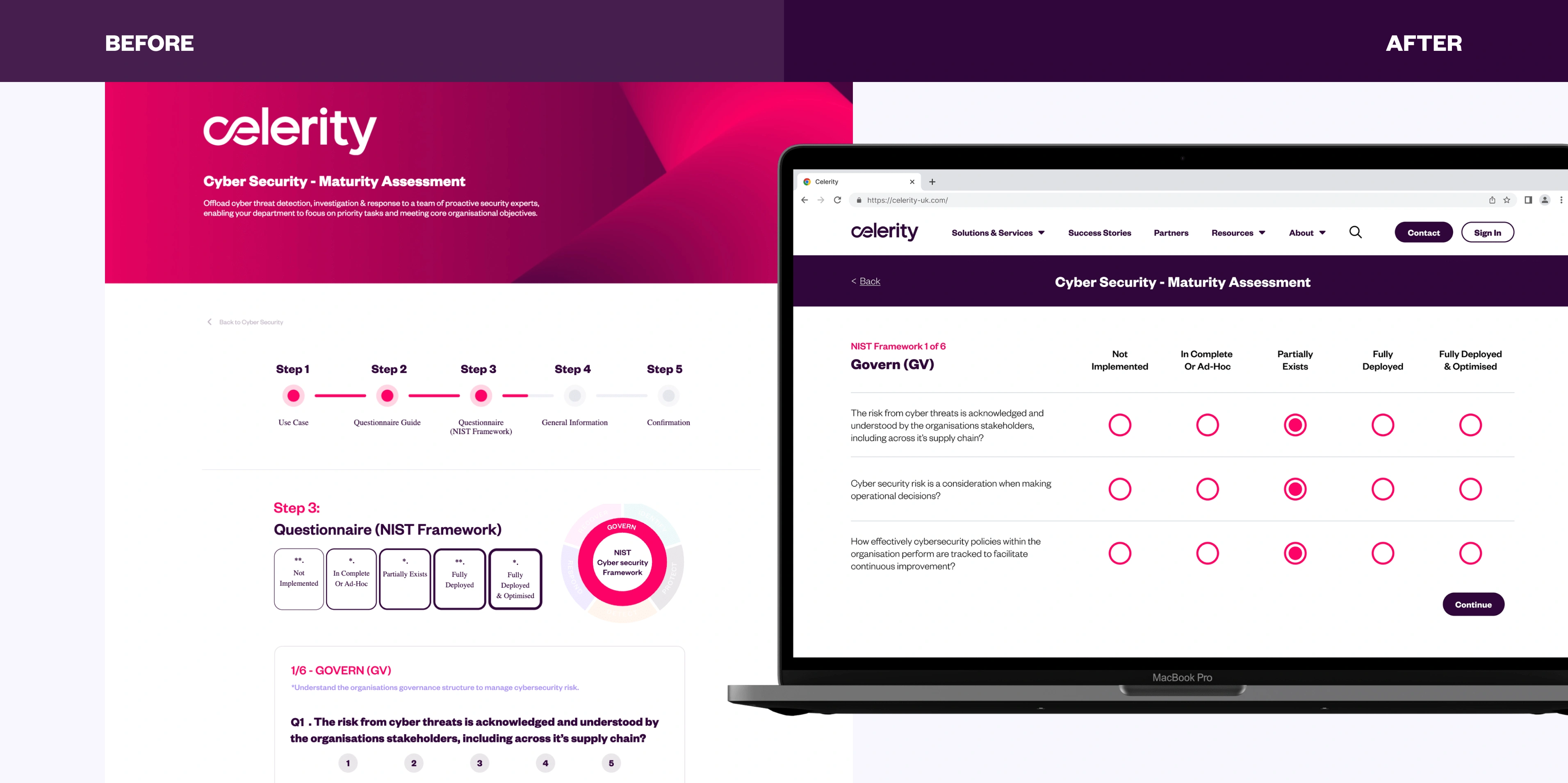
I conducted further research to explore best practices in terms of questionnaire and form design and drew heavily from GOV.UK’s design system. Each of the 5 usability barriers was directly addressed through the following solutions:
I conducted usability tests with internal teams to catch any usability concerns. Due to time and resource constraints, wider user testing was postponed until the post-launch.
The redesign of the Cyber Security Assessment Tool improved the assessment experience but also revealed further challenges within Celerity’s other marketing channels.
Celerity’s website also suffered from usability issues and their existing CMS setup hindered the marketing team’s ability to make timely updates. Therefore, we initiated a redesign of Celerity’s large brochure website, focusing on:
Both the redesigned Assessment Tool and the new brochure website launched in July 2025. With the foundation now solid, we’re entering the next phase.
Celerity has moved onto a Growth-Driven Design Retainer enabling continuous improvement. Through monthly iterations, I’ll monitor real usage, prioritise enhancements based on effort and impact, and execute a roadmap that supports measurable growth.
What began as a UX challenge with a single tool became a company-wide digital transformation creating a frictionless user journey, and laying the groundwork for scalable growth.
Fresh brand identities and website redesigns for three divisions within The Clearbox Group 📣
Read project
Northern Ireland’s modern furniture specialists, a luxury furniture store 🛋️
Read project
With a remarkable 170 years of experience, the experts in construction and civil engineering 🏗️
Read project
A multi-award winning, family owned Holiday Home business, nestled at the foot of the Mourne Mountains ⛰️
Read project
Replace 10+ travel apps with Hidden, connecting you with locals & past visitors to find the hidden gems of your next adventure 🗺️️
Read project
Product design in healthcare technology, shaping a clinical lab web app used by scientists worldwide 🩺
Read project